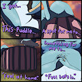
If you had time travel powers, you would be going back in time to watch Slugcat Jesus perform miracles too!
-----
I WAS SICCKKK FOR TWO WEEKS STRAIGHTTT AND GOT NO ART DONEEEEE!! >-<
But now im finally less sick!!! So to get back into doing art again, I decided to draw the thing that I most wanted to draw in the moment. And I had decided that I wanted to draw something related to the watcher! Ive been replaying the watcher dlc update while sick, and felt the creeping urge to draw something really really good for a really really great game once again! :D
I am again, attempting to recreate the painting style of Rainworlds primary artist Miimows! Previous attempts have ended in complete failure but this time im really feelin it!
I am having a wonderful time just trusting the process and learning so many new things! The THINGS you can get away with when it comes to colour are messed up, you would never think that that rock is an unusual shade of blue or that all the walls are this agressive red that I plastered pink over! Stone walls arent supposed to be red!?!?! Yet they are and it looks amazing. I basically never consider color in my art because its hard, and im not good enough to put the thought into it yet, but I think im finally ready to start working with color more! Be less afraid to colour a sky hot pink! Intentionally pick colours that compliment eachother! Make a wall GREEN FOR ALL I CARE!!! Im a sick freak now! I can colour anything any color and get away with it >:)
Miimows rainworld art plays with colour so immacuately. I dont think I have ever seen her use the same colour for the sky ever. So I looked to replicate this and treat the enviroment not like a real thing that must be remade of grey concrete walls, but as a painting meant to look REALLY pretty, and use colours that are unusual but compliment and contrast eachother really well. So that I may call this rainworld art MY rainworld art, and not just a mere copy of Miimows, Invent a new pallet and see if I can capture the feeling through my own colour scheme.
The watcher's pallet is deep blue by nature, so I fought it with radiant light, reds and pinks. The Watcher almost taints the surrounding area with his own color scheme. The saint fit well to counterbalance the watchers darks and is totally a thing thats lore viable and could happen, and that makes me happy.
Backround detail work is still a thing thats hard for me to do well, so the deeper backround bits have ended up looking like I have just smeared vaseline all over the image, and I basically did to be fair, but it works out. I think I failed to capture the detail and interest that Miimows backrounds often have, but thats okay! I think i sucseeded with the colors and the whole "drawing a slugcat that looks good and not like aassssssssssssssssss" thing! So big upths mineth friendth!
Keywords
bat
40,044,
lizard
26,494,
pink
15,212,
sky
10,722,
grass
9,012,
fluffy tail
6,824,
flying
5,792,
hiding
1,214,
fluffy chest
753,
slugcat
737,
rain world
566,
painting (artwork)
235,
skyscape
72,
lizard (rain world)
12,
hiding behind object
7,
saint (rain world)
3,
scavenger (rain world)
2,
watcher (rain world)
2,
batfly (rain world)
1
Details
Published:
1 week, 3 days ago
26 Oct 2026 11:06 CET
Initial: ac177675339638775cc76a680c9e2b45
Full Size: 4cf1df2dc3b3192f7b1da7db98c2cbf3
Large: bfe32b70b40d2b805eb0b6c9b06b9f83
Small: 80fa74933d5c093d2fcab480ebbe85e3
Stats
59 views
8 favorites
2 comments