Welcome to Inkbunny...
Allowed ratings
To view member-only content, create an account. ( Hide )
FriskyFerals
FriskyFerals' Scraps (5)

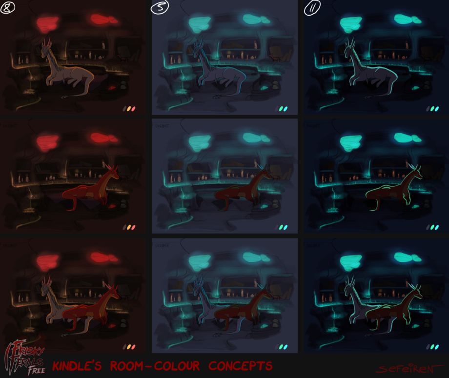
Kindle's Room Color Concepts

Medium (920px wide max)
Wide - use max window width - scroll to see page ⇅
Fit all of image in window
set default image size: small | medium | wide
Download (new tab)
First in pool
Kindle's Dad Concept Art
Are they really just concepts, or does Kindle have the fanciest color changing magical dragon lair bachelor pad in all the land? You decide.

No really, they're just concepts. Kindle couldn't afford the color changing magic water and glowing rocks. He spent all his dragon money on candles and lube.

Keywords
male 1,115,153, female 1,004,949, dragon 139,158, feral 83,169, frisky ferals 1,645, sefeiren 1,347, kindle 599, vera 465, family matters 206
Details
Type: Picture/Pinup
Published: 8 years, 7 months ago
Rating: General

MD5 Hash for Page 1... Show Find Identical Posts [?]
Stats
10,871 views
90 favorites
15 comments

BBCode Tags Show [?]
 
SpyroBeddingCynder
8 years, 7 months ago
Lol.  
Ghostboxx
8 years, 7 months ago
wait! i have yet to see him even use lube so i dont think he bought much
Bahlam
8 years, 7 months ago
Candles and lube are very romantic. 😸
Zotz
8 years, 7 months ago
Or maybe the 'color changing magic water' IS the lube :D ...and it's now all over the floor. Clumsy dragons with their no-thumbs.
MrStealth1993
8 years, 7 months ago
That looks like a very comfy room. And especially wonderful to see that there`s room for two dragons. Huehuehue.
Nicobay
8 years, 7 months ago
the middle one light make it look like a space ship
space dragon ! woooooooooooooooooooo
Otterbutter
8 years, 7 months ago
I prefer 11. It's kind of the same color scheme as 5, but the contrast gives the area a more more secluded, more cozy or comfy feeling. Seeing as we're now in the story part of the comic and there are some hard feelings that they're dealing with, I think that the greater contrast gives more opportunities to use lighting to bring attention to whatever features the scene calls for, be it expressions or items in the surroundings.

8 has some of the same "coziness" to it, but the weaker contrast between light and dark won't have the same effect that I think would fit well for the next leg of the journey. Also between the colors themselves, red and blue, Kindle's emotional state and overall personality is definitely more "blue" if that makes sense.
CyberneticCephalopod
8 years, 7 months ago
QuillnRose
8 years, 7 months ago
AWWW NUMBER 11 LOOKS SO COOOOOOOL
Cyrakhis
8 years, 7 months ago
Dragon money. xD
FoxLogic
8 years, 7 months ago
I cast my vote for #5 here personally
spencersdh
8 years, 7 months ago
Where's number 5?
GreenReaper
8 years, 7 months ago
The one in the middle that has 5 on the top? o_o
redstonedash
8 years, 7 months ago
wait are their bodies intersecting??? curse you 2D art. allowing charecters tofill the same space and still apwar normal!!!
Evret
8 years, 6 months ago
I think the blue looks better Owo
New Comment:
Move reply box to top
Log in or create an account to comment.