Welcome to Inkbunny...
Allowed ratings
To view member-only content, create an account. ( Hide )
Care Bear Cousin Leptictidium
« older newer »
Amethyst's Bikini Blunder
set default image size: small | medium | wide
Care Bear Cousin Leptictidium
Squeek?  Squeek?!  Squeek!
+3
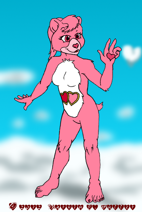
A redesigned Love-a-Lot Bear admires a distinctively-shaped cloud.

Considering mousicorns, pegamousies, and a Crystalmouse have all appeared on my gallery, it wouldn't be surprising if you thought the Mousies were inspired by ponies, but that's not the full story.  There also have been influences from other sources like the Care Bears.  This fixed-up sketch can be considered a precursor to the My Little Mousie series, an experimentation with a more shapely character and the positioning of the tummy symbol.

Fan art © 2012 Marvin E. Fuller
Care Bears and characters TM American Greetings

Keywords
female 1,005,947, bear 45,150, fan art 9,248, heart 8,851, cloud 2,568, care bear 549
Details
Type: Picture/Pinup
Published: 11 years, 4 months ago
Rating: General

MD5 Hash for Page 1... Show Find Identical Posts [?]
Stats
66 views
6 favorites
6 comments

BBCode Tags Show [?]
 
DOtter
11 years, 4 months ago
She's actually cute, very much so.
CyberCornEntropic
11 years, 4 months ago
Thanks.  That's what I wanted since cute is part of the essence of the characters.
DOtter
11 years, 4 months ago
You see, I never liked Care Bears. They're much too cutsy-poo for my taste, too child-ish. This image isn't cutsy, just really cute.
CyberCornEntropic
11 years, 3 months ago
Could be the presentation, I suppose.  The original Care Bears were, like many '80s cartoons (and beyond), meant to be exactly as you described them, cutesy-poo.  Producers think Viewers are Morons, especially when the viewers are children, so it's to be expected.  Plus, they were originally used on greetings cards, so cutesy-poo was almost a prerequisite.

On the other hand, I don't have to go that route.  I don't have to take the naughty, adult route either. :p
CyberCornEntropic
11 years, 3 months ago
I think I see the difference now, upon comparing my picture with the official pictures.  The official stuff overdoes the cute factor whereas mine has less chub, is not as childishly small, and isn't trying to rot out our teeth with a saccharine pose. :o  Not bad for a redesign meant to see how a tummy symbol would look on a more human-proportioned Care Bear. :p
DOtter
11 years, 3 months ago
Not bad at all. :)
New Comment:
Move reply box to top
Log in or create an account to comment.