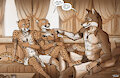
Artwork Text Description: Digital greyscale illustration of an anthro-furry bevaal cheetah male warrior named Ti’maar. He is leaning against a wall with crossed arms and an annoyed expression looking at someone out of view. He is saying in text dialog “You know that’s not what I meant.” He is wearing light armor, an open bevaal tunic, and heavy cloak with hood. A dagger is in a cloth wrap on his waist and has a long kukri at his hip. Drawing was an experiment to test new greyscale techniques and textures.
-----
Originally drawn back right at the start of January as a comic coloring experiment. The colors were just ok, but I wanted to do a different experiment with greyscale instead so I repurposed the inks for this.
I've been pondering doing my comic in greyscale for a long time because the insane amount of work it will be. The intimidation is crushing lol. I've done many experiments over the years, but never quite found a workflow I was satisfied with. I looked around at other greyscale comics and manga and there is such a huge variety of great approaches. But thinking about it, I thought I should try something similar to my normal workflow instead of trying to reinvent the wheel.
So this is my take on it I guess. It is quite similar to my normal color workflow with a few differences. The usual flats colors are now greys limited to a palette of 8 grey values + black and white. The usual flat colors are bumped up in value to make everything brighter and more readable. The inks are much heavier, with the ambient occlusion layer being replaced with ink and extra hatching. Also, with it no longer being color, it is much easier to have a heavy emphasis on texture (which I would probably go even harder on next time.) Shading wise the shadows are less contrasted, to avoid things getting too dark/muddy and hard to read (problem I've had with past attempts.) An overall focus on readability and careful attention to contrast would be important in the context of a comic I think.
I am not super attached to color in comics (me working with color in general has always been strained lol), but this experiment is the first time I think I have done one of these greyscale attempts and been truly happy with it. I'll keep you all updated on if i decide to move forward in this style as I work on the comic. Anyways I've not been super in the mood to post still despite the backlog growing, but thought I'd post this on FA right now while it's fresh in my mind! -----
the pointillation and the speech bubble style are giving a «retro taste» to the drawing, has more personality, even if your style is immediately recognizable
the pointillation and the speech bubble style are giving a «retro taste» to the drawing, has more pe