Hmm :) You commented elsewhere that you'd like some criticism, so here goes. Oh, also, standard disclaimer, please feel free to disregard anything and everything I have to say.
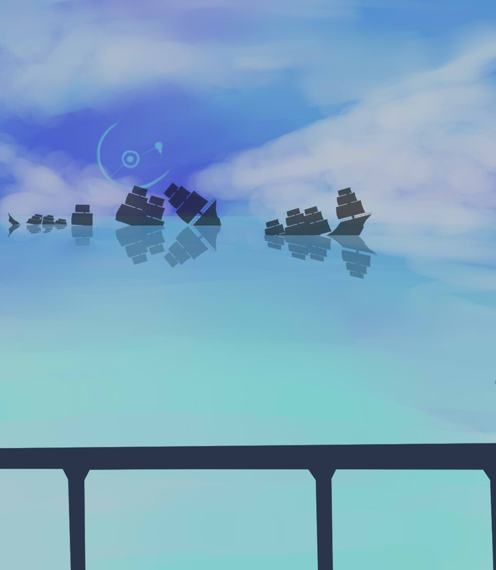
First up? Love the subject matter and the overall feeling of serenity. Good colours and you've even done a pretty good job of making it look like the clouds are mirrored in the water's surface.
As for areas for improvement? Well, firstly, there's no light source in the picture, so it's unclear why the railing and ships are in silhouette. If the astral-scale blue object is intended as a light source, it would explain it, but it just doesn't seem bright enough. (the sun in your more recent picture is a much better example of good lighting)
The ships appear somewhat translucent. In fact, in the second ship from the left, you can see both the change from sea to sky and the blue sky-object. This gives the impression that the sails aren't opaque (which you might have been going for) or that the symbol is in front of the ship (which you probably weren't going for).
The ships themselves could use a little work with making them appear to be three dimentional. You can see from the shape, for example, that the two sails of the second ship (the one mentioned above) are different distances away from us. The points at which they intersect the water would different. The further away sail would cut a line into the water higher up on the picture and the closer one would be a little lower down. Even if it's just a pixel or two's worth of difference, it'll probably make it pop into a more 3d shape. As it is, all of the wrecks look almost flat.
The ship on the far right is another good example. The shape of the sails suggests it was sailing at an angle (I'm going to say towards the horizon rather than towards the camera) But the line with which it cuts the water is parralel to the edge of the picture, making it look like it either has a very flat edge going left to right as it cuts the water, or that it's been flattened.
Put a book onto a table at an angle and then get down low to take a look. If you imagine the book is actually a box sunk into the surface of the table, you'll see that the bottom line isn't horizontally flat at all. It'll help you get more of a depth to the shadows.
Speaking of depth, the railing at the front looks very flat. It's close enough that even in with a strong back light there would be some gradiation in the shadows. If you play around with some insanely dark... uhh... I'd be tempted to say purple, but it's been years since I read about colour theory, either way, you haven't gone for a 100% black for it, this is good. Maybe play around by adding some texture and colour variation into the darkness of the railing. Might make it more visually interesting.
Lastly, I'm going to hate myself for saying this, but... Composition! This is just aching to be a wider picture, or perhaps to have a reason that the view is so restricted. (Perhaps we're looking out of a train window or something?) The ships aren't dead centre, which is a good thing. But yeah, personally, I'd be tempted to suggest it would look a lot better if there were just simply more open water on either side. Easily an extra 50% of the width of the picture to the right and maybe another 25% to the left.
Anyhow :) That's me utterly dry of things I could think of. I hope there are some useful things to consider.
Hmm :) You commented elsewhere that you'd like some criticism, so here goes. Oh, also, standard disc


")


