Welcome to Inkbunny...
Allowed ratings
To view member-only content, create an account. ( Hide )
IMER
« older newer »
CATPROWLER

Medium (920px wide max)
Wide - use max window width - scroll to see page ⇅
Fit all of image in window
set default image size: small | medium | wide
Download (new tab)
by Aogami
MARQUISVULPES
+2
CATPROWLER
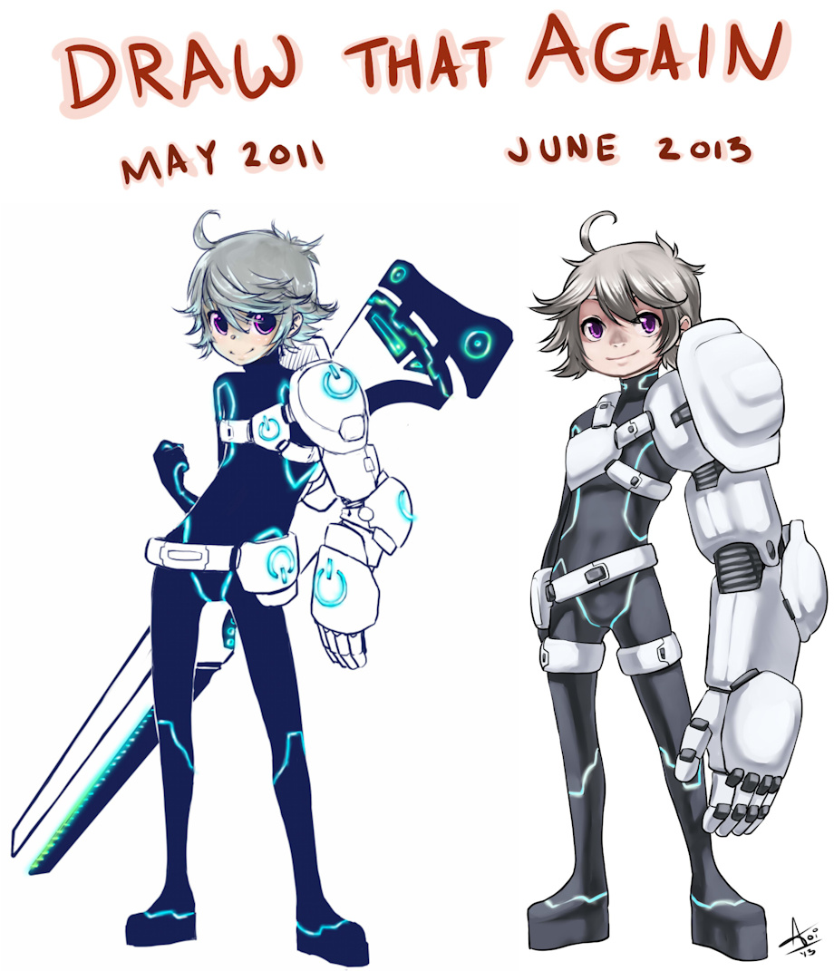
Improvement thingy comparing my art now against it from two years ago around the same time. I've improved more than I thought although I kinda cheated cuz I changed his design some haha :P

Keywords
male 1,179,576, human 107,038, shota 33,625, sword 10,109, armor 9,231, sci-fi 4,672, scifi 4,184
Details
Type: Picture/Pinup
Published: 11 years, 6 months ago
Rating: General

MD5 Hash for Page 1... Show Find Identical Posts [?]
Stats
1,929 views
74 favorites
97 comments

BBCode Tags Show [?]
 
FidelTheMouse
11 years, 6 months ago
Looks amazing. =3
Aogami
11 years, 6 months ago
n.n
mobkiller
11 years, 6 months ago
There is lot´s of improvements^^
And the new design looks a bit better than the earlier one :)
Aogami
11 years, 6 months ago
yay, glad you like the improvements i made. I think the larger arm looks better haha
mobkiller
11 years, 6 months ago
It looks better^^
The whole glowing stuff was too distracting. Sometimes less is more, and by enlarging the arm you made him look more bad-ass. Give him an evil smile and he looks like a stage-boss for a video game. XD
Aogami
11 years, 6 months ago
Rofl like if you smashed Tron and Gungrave together :P
Bianca
11 years, 6 months ago
broken spine aside in the left one, Ir eally like what you were doing :o
Aogami
11 years, 6 months ago
lol yeah I did always think it looked kinda off, but what do you mean by "what I was doing"
Bianca
11 years, 6 months ago
Colour vibrancy and it's not as 'soft' as your stuff now. :3

(personal tastes, not technical issues. :o)
Aogami
11 years, 6 months ago
Well, yeah I did the entire thing with flats before because I wasn't very good at shading at the time. xD
Bianca
11 years, 6 months ago
Yush, shading aside. I meant more the lines and palette have become softer'n stuff :3
imer
11 years, 6 months ago
cheats! D:
Aogami
11 years, 6 months ago
arthax
imer
11 years, 6 months ago
uuh..bless you?
Aogami
11 years, 6 months ago
sorry. Art-hax. :P also thank you
imer
11 years, 6 months ago
oh..I didnt see that.. feel like an idiot now..
Aogami
11 years, 6 months ago
rofl no worries. When I read it again I was like "Wtf was I trying to-oh yeah I remember now"
soggymaster
11 years, 6 months ago
Probably took you half the time as well!
Aogami
11 years, 6 months ago
lol idk about that ... I can't remember xD
NeksusCat
11 years, 6 months ago
Woah, the improvement is really at hand! :D
Great work! Your style looks way better if to compare those two, yet never the less cuttier! Maybe even more~
Aogami
11 years, 6 months ago
haha yay ~ I wouldn't want to sacrifice cuteness xD
NeksusCat
11 years, 6 months ago
Never sacrifice the best! D8
Demesejha
11 years, 6 months ago
Anatomy is better on the new one but I feel proportions felt better on the older design. Sleek and chic.
Aogami
11 years, 6 months ago
He was a lot taller and thinner before that's true. I felt awkward keeping him that way because the old flat-color blocking is more stylized whereas I was more focused on technique and rendering for the new one, and correct anatomy was a bigger concern.
Demesejha
11 years, 6 months ago
Right. He reminds me a lot of Blanck from solatorobo. Probably the hair.

Neat in either way really.

Picture of Blanck for flavour on my text.
Aogami
11 years, 6 months ago
Huh ... you know I own that game but I didn't get very far. I should go back and play more of it sometime. I didn't even get to meet this guy xD
Demesejha
11 years, 6 months ago
*chuckles* Its really great.
Aogami
11 years, 6 months ago
Yeah I liked what I did play of it ^^;
Graveyardmonkey
11 years, 6 months ago
dont get me wrong but i like your past one better =w=
the body and all look great but the secon the color look even better =w=

but again every evole in to some thing right =w=
and beside your art is better then mine T^T
Aogami
11 years, 6 months ago
I'm getting this response a lot. I must be doing something wrong lol
Graveyardmonkey
11 years, 6 months ago
lol not realy
you did not get better but
you just chnage your way how to draw thats all realy
they both look very good
BioAlma05
11 years, 6 months ago
You really improved a lot, but I got to that I like his old design better; his arm looks way to heavy for him and the symboles kind of finisht him. tho, the lichts are better this way.
Aogami
11 years, 6 months ago
You're not the only one who seems to be along this line of thinking. A lot of people like my old stuff better. And here I was thinking I'd made some progress hahaha
BioAlma05
11 years, 6 months ago
O, but you did!
The hair, face and hips look much better!
Aogami
11 years, 6 months ago
As for the armor being too heavy for him, it's made out of some super-light futuristic alloy that's conductive to the resonant energy of the planet where it draws it's power from. It's basically coated in a thin sheath of electromagnetic energy that makes it impervious to most metals and energy weapons. PRETTY COOL STUFF and I like it because it's a fusion of magic and tech ~ he comes from a pretty detailed universe actually
BioAlma05
11 years, 6 months ago
0.0 Thats awesome!
Aogami
11 years, 6 months ago
Yeah. Back in the day a friend and I were trying to design a world that could incorporate steampunk, high fantasy and soft science fiction all into the same story. It ultimately failed but there ar estill a lot of cool bits and pieces that I use for other things :)
BioAlma05
11 years, 6 months ago
I would love to see more pictures of that world, do you still got some? Please put them on Inkbunny if you have!
Aogami
11 years, 6 months ago
Most of it was text and background info for a roleplay. Not a lot of drawings xD
BioAlma05
11 years, 6 months ago
Do you have any other characters? Could you paint those?
Aogami
11 years, 6 months ago
not for this one, no. It died pretty quickly xD
BioAlma05
11 years, 6 months ago
Ok, I still like this pic :)
Aogami
11 years, 6 months ago
haha yeah ... at least some good came out of it xD
BerretMC
11 years, 6 months ago
you definitely improved. However, I much prefer the compact design of the mecha arm.
Aogami
11 years, 6 months ago
The concept was that it's part of a salvaged suit of mech armor and all he could get out of it were the arm and power supply. It's a hyper light-weight metal strengthened with some kind of science power like idk ... it's sheathed in an electromagnetic field that repels metals from the surface - i.e. it's bullet/sword-proof.
DMDOKURO
11 years, 6 months ago
Super progress! .... Now if only I can do the same with my 3D art. X3
Aogami
11 years, 6 months ago
good luck!
Xercei
11 years, 6 months ago
Awesome improvements! ^_^
Very cool to see a direct example of your progress :D
Aogami
11 years, 6 months ago
Thanks :)
JanKiba
11 years, 6 months ago
Definitely much better art-wise on the new version.

The old version's arm-design may be a bit better though. Though if you tried to do it exactly the same, it would look better now :p
Aogami
11 years, 6 months ago
maybe I should go back and rework it
sumyunguy
11 years, 6 months ago
I am surprised no-one has made the 'I'm single and my left arm is a lot bigger than my right arm, if you know what I mean!' joke.

In my opinion, the change seems lateral, that is to say, not necessarily better or worse but more a change of style. Both of these look pretty good to me for various reasons each.
Aogami
11 years, 6 months ago
hur hur. I think there's definitely improvement in the shading and rendering, and in the anatomy and face especially I don't like the old style at all anymore, although there's some stuff to be said for the stylistic way it's drawn that I stll like or could find useful
sumyunguy
11 years, 6 months ago
Mmhm! As I said, I like the left style for various reasons, but I also like the right style for other reasons. I can clearly see what you mean about the shading, but then again, there was next to no shading on the left one. Cannot compare paint when you're comparing walls, one with and one without paint, when what you're looking at is how well it's constructed.
someonegone
11 years, 6 months ago
I like the style of the mecha arm. Were you by any chance inspired by the game Sanctum for this drawing?
Aogami
11 years, 6 months ago
Never heard of it, but I can't say the idea wasn't drawn from anywhere. I don't remember what inspired it ... maybe some Tron and other stuff xD
zeuste
11 years, 6 months ago
The body in the new one looks great!
Though I prefer the head/face from the first version xD
Aogami
11 years, 6 months ago
That's funny cuz I hate the head in the old one xDDD
soina
11 years, 6 months ago
I prefer the first version xD thought the body angle looks wrong, i prefer the style, your colouring is better then before but i can't say i really see much improvement in style but then i prefer more anime style, so it just depends on peoples tastes :3
Aogami
11 years, 6 months ago
Yeah I'm getting this response quite a lot, more than I expected really. Then again, I'm just a very glacial artist in terms of improvement. Everything takes me ten times longer and a hundred times more work to do than most people xD
MaraschinoBunny
11 years, 6 months ago
no sword and cool glowy power on symbols for yoooou new one you'v just bin working out and git a bigger arm.....and wow what a change in styles in just 2 years.
Aogami
11 years, 6 months ago
lol maybe people would have liked it better if I included that stuff
MaraschinoBunny
11 years, 6 months ago
maby (gos back to being a perv about this and suff ^_- in her head)
Ruffy
11 years, 6 months ago
Wow so many people already X3 haha, but really that is some amazing progress :D and it makes me want to get some armored Ruffy pictures sometime <3
Aogami
11 years, 6 months ago
if you say so. I've gotten more comments telling me they like the old one better actually. I'm kind of depressed about it rofl
Ruffy
11 years, 6 months ago
I do say so, a lot of those comments refer to the content more than your evolution in your art, the new one is much more refined and "correct" for lack of a better term, You should be proud how far you've come in such a short time, not bummed cause some one is missing the glowy bits and cannon in the new one silly *squeezes*
Aogami
11 years, 6 months ago
It's seems like maybe I lost something in the design department even if my technique is more refined, and that makes me a little sad
Ruffy
11 years, 6 months ago
I can't agree with that X3 design is too subjective, I like the new design, in my eyes it works better :3 and of course others will have other opinions but that's not really a basis defining the improved quality of your work
Aogami
11 years, 6 months ago
I spose that's trueeee
Ruffy
11 years, 6 months ago
Afterall, its not like you couldn't have put the gun or glowy bits in, you just chose not to~ but had you they would also have shown the same improvement in ability as the rest of the picture :3
Aogami
11 years, 6 months ago
I spose so. People seem really hung up on it though. and I keep getting people telling me that I'm not better, just different now lol
Ruffy
11 years, 6 months ago
I think after reading through a few I would have to very politely disagree X3 while both look great the more current one shows improvements in mechanics and pose and the important quantifying parts of art, again I think for many they're basing it too much on their personal likes and dislikes rather than an objective assessment of the art itself, which happens~
Aogami
11 years, 6 months ago
I should have made more of an effort to keep the design the same so that a more objective assessment could be made I suppose. Ah well
Ruffy
11 years, 6 months ago
Naw you did what you wanted to do :3 and it looks amazing <3
KitSoone
11 years, 6 months ago
Both are pretty good! Clearly an improvement, though, as is to be expected, particularly in the pose and cleanliness of its presentation. Also noticeable - although not quite as critical - is that the mechanical arm is now much larger, which is a nice touch. And for what it's worth, I feel like the older one is giving off a bit of a Scott Pilgrim style...
Aogami
11 years, 6 months ago
lol that's funny because at the time I was quite taken with Bryan Lee O'Malley's style. I guess osme of it leaked in there :)
BunnyBoyLen
11 years, 6 months ago
それがすばらしです。ほんと、アオガミサン;;
Aogami
11 years, 6 months ago
本当にありがとうございます。レンさんは僕のために”上手”だと言ったけどマア…まだみちがずっとながいです。
MakoRuu
11 years, 6 months ago
They're both good. Lol
WeirdPurpleBunny
11 years, 6 months ago
I like the glowy bits! :)

Also I like the big rifle thing in the first pic.
(Although I suppose a giant mechanical hand that looks like it could backhand someone through a brick wall could be useful in a fight too...)
Aogami
11 years, 6 months ago
Yeha it's very  Tron inspired. I should go and redo the rifle at some point too I spose lol
WeirdPurpleBunny
11 years, 6 months ago
Nah, it's up to you :)
Looks good with the big hand too.

Gotta be really badass to bring a giant metal fist to a gunfight ;)
Aogami
11 years, 6 months ago
hellz yeah. Bigger IS better
Kabanzai
11 years, 6 months ago
Honestly, I prefer the original. the style fits the picture more XD
Aogami
11 years, 6 months ago
sad days. Two years of work for nothing
Kabanzai
11 years, 6 months ago
Nah, Smut got alot better XD
Aogami
11 years, 6 months ago
lol ... thanks
LittleMicah
11 years, 6 months ago
It's always fun seeing artists improve, even more so seeing an already epic artist get even better. xD
Aogami
11 years, 6 months ago
I'm glad you think so ~ seems about 50/50 with people saying I haven't improved, just changed, or that they outright think the first one is just better lol
LittleMicah
11 years, 6 months ago
Well, that remaining 50% seems to put preference over application here. I like the old one too, but I can see a dramatic artistic evolution between the two, and I like the newer one better. |3

Then again, the consumer end of art is ALWAYS preference focused. I wouldn't pay that the preference bit much attention unless it was a commission, truth to be told.
Aogami
11 years, 6 months ago
It's just depressing I guess that so many people think I haven't gotten any better TuT
Catwheezle
11 years, 6 months ago
I think your newer one shows a great amount more confidence - not just confidence in your lines (they are bolder, stronger, cleaner), and in the quality of your art, but also the design shows more confidence in your vision. Confidence that the mode subtle lights would work, confidence that you could go over the top with the arm and still have it work, and so on.

But in every change, there will be good in the old. I like the old pose, though the new pose is just as good in its own way. The old pose was cooler, more graffiti-wacky; the new is more real and solid.

You've really developed a lot in that time, and your style has changed and evolved. I like seeing this evolution :)  Maybe revisit it in two more years?
Aogami
11 years, 6 months ago
Yeah, I really liked this piece when I made it which is why I chose this one, so maybe next year around this time I'll take another crack at it, or I'll go and try for a different piece I really liked sometime
JakStrieder
11 years, 6 months ago
I fucking love this!!!!!! please do more of him or them or what ever please do more
Aogami
11 years, 6 months ago
rofl I don't really use this character anymore, I just chose this for the draw this again thing because I liked the original drawing x3
JakStrieder
11 years, 6 months ago
awwww pleasesssss, I'll give you cupcakes or cookies
JakStrieder
11 years, 6 months ago
this is the second time I've looked at this pic ins today and I got to say again how much I love it and would absolutely die if you did more of them or gave them more armor hehe I love symmetry.
New Comment:
Move reply box to top
Log in or create an account to comment.