Welcome to Inkbunny...
Allowed ratings
To view member-only content, create an account. ( Hide )
Ceremony
« older newer »
SoraSlipheed
SoraSlipheed's Gallery (90)

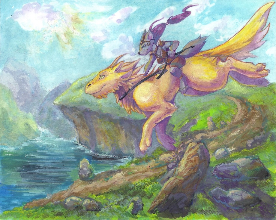
Journey (please critique)

Werewolf (for sale)

Medium (920px wide max)
Wide - use max window width - scroll to see page ⇅
Fit all of image in window
set default image size: small | medium | wide
Download (new tab)
would appreciate some critique on this piece, what you do or don't like and why. Do you like the fantasy theme? Do you think i should outline more? What about the colors? Things like that would be super helpful to me.
Tell me what kind of art you guys like to see.
I'm trying to give my characters a theme and setting instead of just floating around.

Gouache on 8"x10" Multimedia art board.

Keywords
fox 231,883, wolf 181,311, dragon 138,413, painting 8,118, dragonfox 338, journey 211, gouache 116
Details
Type: Picture/Pinup
Published: 11 years, 1 month ago
Rating: General

MD5 Hash for Page 1... Show Find Identical Posts [?]
Stats
103 views
14 favorites
9 comments
BBCode Tags Show [?]
 
blakjakal
11 years, 1 month ago
A little bit more outlining wouldnt hurt ^ ^ mostly in the foreground the backgrounds fine as is
SoraSlipheed
11 years, 1 month ago
I might try that, thanks for the comment :)
NeksusCat
11 years, 1 month ago
So beautiful! *O*
Well, i DO like fantasy, even more like LOVE fantasy! ^w^
I can't find anything that i don't like, the work seemse amaizing to me! Well, maybe more details? They are hard to make and could lead the whole picture into a big mess, so making them succesfuly and into right places, would add more feeling of a greatly done work. Something like this, i guess.. ^^'
Not that here's not enough details, but they're looking a bit faded..
I do like the magic and weaponry, so seeng more of this would make me happy! Xp
SoraSlipheed
11 years, 1 month ago
Thanks for the comment ^^
NeksusCat
11 years, 1 month ago
Welcomies~! ^w^
AlphonsusPShamshir
11 years, 1 month ago
If you darken the foreground and the figures a little (or add more bold color to them) and lighten the background they'll stand out more. Otherwise dont change a thing. This is REALLY good =^v^=
SoraSlipheed
11 years, 1 month ago
Thank you ^^
AlphonsusPShamshir
11 years, 1 month ago
dude, YOURE the one who made my day. Feel free to hit me up for anything, any time of the day. Im awake eighteen hours out of the given 24
Nightwalker
3 years, 9 months ago
I like how the colors in the background seem to grade over into each other (the blues and the greens respectively) but yet still there are distinct areas of different shade. I wish I could do this like that when coloring.
New Comment:
Move reply box to top
Log in or create an account to comment.