Disclaimer: I'm not an employee nor affiliated with Inkbunny's staff. This is just a concept I wanted to show.
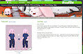
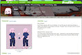
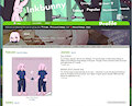
In order the images are shown:
1st image: no gradient, buttons hard to see
2nd & 3rd image: black colour overlay
4th image: Gray colour Inkbunny use with transparency added. Image a bit washed and buttons a little mixed in bg.
----
Explanation below
While I sit here waiting for more bun, I've been a little invested with making banners and cover images that I wanted to mess with conceptual ideas.
Inkbunny's a neat site, but I felt it could add a few little elements if major revisions are not viable. One such example is calling cards/banners whatever you call it or could treat it like nameplates on Discord (or calling cards from Call of Duty). It's basically a little image banner over the user profile while not interfering with the other parts of the site.
Inkbunny's user banner is roughly 1000 X 119, which is a bit small, but expected when compared to other banners on other websites. Since the buttons are on top of the background, the background must have a colour layer over it so the buttons can be easily seen. I tried using the default the colour of the user background (#333333 & #555753) with some transparency, but it made the buttons a little hard to see or made the image look "washed". Black proved to the most efficient, while it does darken the image, it did the least harm while making the image and buttons visible.
Now does this help the site, improve features, is necessary?
No.
It's just a little cosmetic idea to help customize the user page a little. I made this because I was bored. Anyways more bun coming soon, I'll probably throw this in scraps soon.