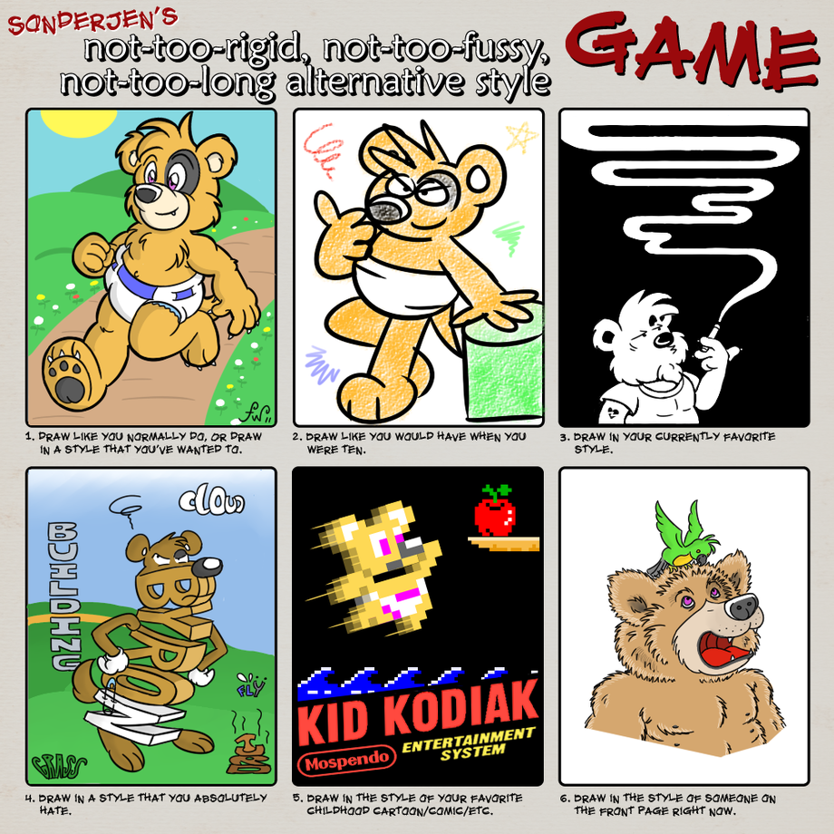
You want descriptions? I've got descriptions. In order:
1. Official Design. Okay, I gilded the lilly just a little bit... you very rarely see Byron with pupils. However, aside from that one detail, this is the way Byron is supposed to look. He's chubby, he's orange, and he's headed your way! (Better have cookies when he arrives.)
2. Through a Child's Eyes. Byron didn't exist in the 1980s, but I'd imagine he might look a little like this if he had been around to savor the fruits of that most radical decade. Like most children of the time, I was obsessed with Garfield, which is why Byron has bulbous eyes. I wasn't doing a lot of coloring at the time, but if I had been, I probably would have used colored pencils rather than crayons as shown here.
3. India Ink. I love this stuff! You cover the front of a piece of card stock with the ink, let it dry, then carve out an image with an X-Acto knife or the pointy end of a compass or whatever. The artwork is stark yet very striking, with every line jumping at you. Best of all, thanks to the wonders of 21st century digital illustration, you can just press Ctrl+Z whenever you make a mistake, rather than throwing the page out and starting from scratch!
4. Word World. If you like your cartoons with pan-to-the-face subtlety and an appalling lack of creativity, brother have I got a show for you! There's a series on PBS called Word World, where all the characters are built from letters. Yes, it looks just as stupid as you'd expect, and the fact that they're computer rendered doesn't help matters.
5. NES Launch Title. Back in 1986, when the video game market was still making an uneasy recovery from the market crash three years prior, Nintendo released its games with minimalist box art. Instead of the intricately detailed, 70's influenced images on Atari game boxes, you were given only slightly embellished scenes from the games themselves. By today's standards, you'd think Nintendo was phoning it in, but the box art was eye-catching and surprisingly effective as a marketing tool. Previous game companies tried to hide their graphics, but Nintendo wore them as a badge of honor... and rightfully so, since the NES represented a quantum leap forward for video game graphics.
6. Realism. When I looked on the front page for inspiration for this last image, a drawing by Pinpoint popped up. His art leans toward the realistic, so I thought I'd take that approach with Byron, drawing him as he might appear in real life. He's got the small inset eyes and shaggy fur of a brown bear cub, along with the pudgy torso of a human toddler... plus a few extra nipples. (Bears have six. The Cleveland Show did not lie to you about this. Also, don't ask me how I know this.) I very rarely draw Byron realistically, because without artistic license he ends up looking like a twisted creation of Dr. Moreau. Still, I come back to the idea from time to time, hoping I'll find that magic trick to make a living, breathing version of Byron that doesn't make you want to run out of the room screaming.
Keywords
male
1,263,239,
diaper
84,720,
bear
52,582,
babyfur
41,676,
diapers
23,425,
nintendo
21,557,
brown bear
1,991,
realism
554,
nes
427,
naive
270,
india ink
6,
word world
3
Details
Published:
14 years, 3 months ago
15 Nov 2011 19:05 CET
Initial: 717e4eae21d08bcbba517114dff060f5
Full Size: 76066eaf3873f7d8d1ee067fcdb5891a
Large: 3cfdd97e5bb7a9d7ebda53221b8e2456
Small: 356e5a5f3366ca786da19f23da32d089
Stats
252 views
15 favorites
3 comments
