Welcome to Inkbunny...
Allowed ratings
To view member-only content, create an account. ( Hide )
How to draw the CORRECT GENDER UNICORN!
« older newer »
ZeloxQuo
ZeloxQuo's Gallery (124)

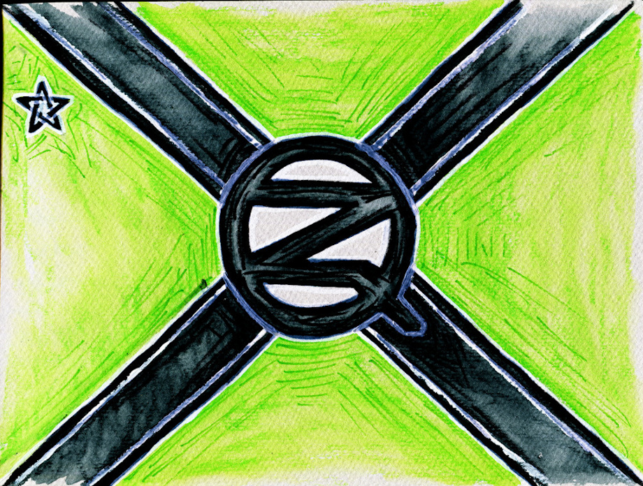
Updated ZQ flag design

CHARGER into battle

Medium (920px wide max)
Wide - use max window width - scroll to see page ⇅
Fit all of image in window
set default image size: small | medium | wide
Download (new tab)
Alrighty. Took on board the comments from the last flag, and wanted to redesign it to look better.

I feel that this is an improvement from the last.

Very thankful for the comments regarding changes and things like that, so thank you for that.  : 3

Mostly done with watercolour pencil on paper, and some white paint.

Keywords
black 13,790, green 9,668, design 4,310, flag 1,867, z 211, q 66, quo 52, zelox 39
Details
Type: Picture/Pinup
Published: 7 years, 10 months ago
Rating: General

MD5 Hash for Page 1... Show Find Identical Posts [?]
Stats
19 views
0 favorites
3 comments

BBCode Tags Show [?]
 
Roxxas
7 years, 10 months ago
lemme guess, a lot of people complained on how the last flag looked like the Confederate one and thus how 'horribly racist and evil'
it was.

their idiots.
ZeloxQuo
7 years, 10 months ago
Heh, no.

I usually get very few if any comments. Was taking the constructive criticism on board to create a better design.

But, there were a few who said that it looks like the Confederate Battle Standard, not judging it seemed.
Roxxas
7 years, 10 months ago
that's good. with the... events of last and into this week Anything Confederate seems to set people off.
New Comment:
Move reply box to top
Log in or create an account to comment.