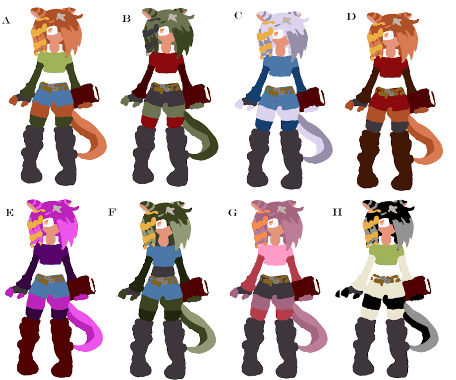
;s you can see, I'm still working on Edolie's design. I've never been much good at settling on character designs, and have difficulties sticking with design.
So I'm pretty sure I'm 90% locked into the clothing design (them denim shorts though :0). Just some accessories and shiz to add. Now I've got to decide on a colour palette! I've added 2 sets of images; 1 with additional fur highlights, one without. I need you gais to help me settle on something awesome, so a penny for your thoughts would be awesome :0
A) First colour I drew up while working on the new design. I wanted her palette to feature green & red shades, as I like this complimentary colour palette (like her original design; see B), but with some brighter colours.
B) Colour palette from her ye olde original design, many many years ago when I was but a young...ish man.
C) This one's a bit out there for me. A bit "cooler" colour wise, so I'm not sure I'll settle on this for Edolie as I always imagined her with a darker colour. But I'll probably use this for another character. Monochrome-ish?
D) As with A, but with clothing primarily in reds and browns; more monochromatics design.
E) OMG TEH PUPRPRPRPZZ! Too much for me, but I thought I'd give it a go anyway :3
F) B fur colours inverted; Tried swapping out reds for blues. Not sure It works; might work if the shades of green and blue were closer together...
G) I really like this one too, but it feels a bit to Amy Rose-ish, even thought it's less saturated than her colours :0
H) WAT THIS I DUN EVEN. Reminds me of old gameboy colours ;p
Personally I'm leaning on A, B and D from set one, and equivalents from set 2... actually I'm starting to think it might look better without highlights...kek : I
Keywords
female
1,108,029,
sonic
62,330,
otter
36,704,
sonic fan character
16,969,
sonic oc
14,698,
design
4,322,
designs
745,
sea otter
586,
edolie
19,
edolie braithwaite
19,
attack of the colours
1
Details
Published:
8 years, 5 months ago
31 Jan 2017 19:49 CET
Initial: 223dddbe06a6425cb9578af5188f91ff
Full Size: e5d041ab26e7ef9be631718dc26e46f7
Large: 761c3fa8f63ee5a1e92107a45db3c11c
Small: 72b728489f83df8f18cb8ccd4318c0cf
Stats
25 views
2 favorites
5 comments
