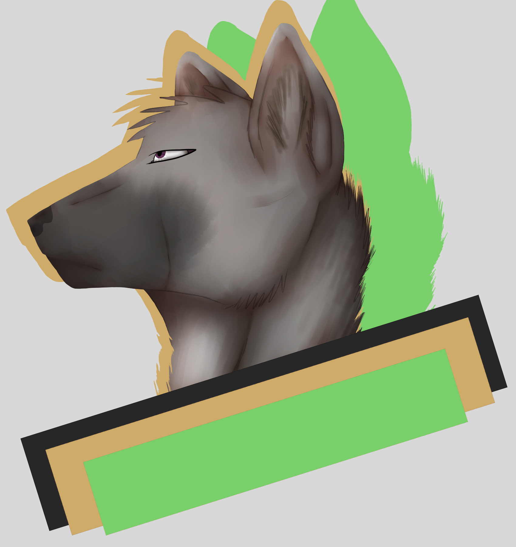
Decided to make a test, how to make Icons look more interesting.
I dont know if I let them stay like this, or make a clean Lineart.
Let me know what you guys would prefer and I might offer these in the future.
The Fields can have different Colours and the Green one in this Pic is supposed to have the name from a charakter in it.
Details
Published:
8 years, 4 months ago
26 Nov 2016 14:27 CET
Initial: 2655e6ecbb8865db678943d34ae6c2fe
Full Size: 210e8d8541efc7bc088a2ec50f3c620a
Large: 61e34f107c6fe6d733f650d5c1b1e744
Small: b62fc983aca0cb8e824d8be16970a848
Stats
2 views
0 favorites
0 comments


")


