So, for several months I've been working on the redesign for SoFurry.com. I've been significantly involved with its development (if not the actual day-to-day) for close to two years now. I haven't made a big deal of my involvement, partially, and this is kind of petty, I wasn't happy with the way the site wound up looking and rather than go into which aspects of it I was and wasn't responsible for, I just shut my trap about it.
But Toumal and his coders have been doing mad crazy work on the upcoming 2.0 release, I've been working with them intensely on developing the new look and feel, and frankly I'm too excited to keep quiet any more.
I's an astonishing amount of work, as anyone who's done serious web design for complex systems can tell you. Balancing consistency with context-sensitive functionality is a massively iterative task. I've produced hundreds upon hundreds of drafts, constantly tweaking and revising this or that interface because it turns out that another part of the site needs more space, and so this area must be expanded to maintain consistency, but then that area is no longer in view when the page is loaded on a less-than-HD monitor...
This has been a massive exercise in reductionism. Taking the vast array of functionality SoFurry already offers, plus the cool new stuff coming in 2.0 and smoothing that down into the most usable, least intrusive form. "But Alex, how will people know about this or that function if it's not at the top of the sidebar?" a coder would ask me. "Shut your ugly face, nerdhole," I'd say, and adjust my turtleneck and sip my cappuchino macchiato, "You should know better than to question an arteeste."
There's still a whole bunch to do. The 'completed' areas are being mashed into HTML and PHP and JS and other FDA-approved TLAs, and when the closed beta starts I'm sure I'll have a bunch more work to do becaus I -- yes, it's possible -- hadn't thought of every little goddamn thing.
It's unfair, of course, to claim that this is solely my work. The coders and Toumal have been invaluable and on a fair few occasions have put me in my place when my drive to simplify came at the cost of significant functionality. Others have proposed sometimes subtle, sometimes radical adjustments and while obviously I fought every single one of them tooth and nail, some of them made this stuff much, much better.
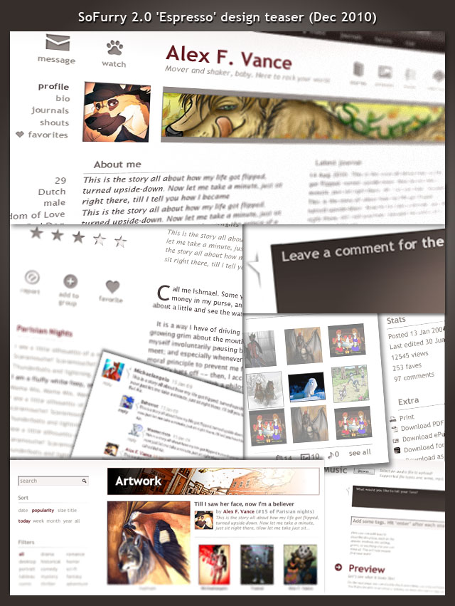
So here's a sneak peek. I know, it's corny, it only shows a few glimpses and since this is all placeholder stuff (note that all the visible art and icons were stolen and do not imply endorsement on the part of their owners -- except myself, natch) so the vaguely visible references to Moby-Dick and the Fresh Prince of Bel Air are kind of ridiculous. There's more to come, lots more.
A lot of work has gone into the story listing, fltering, and display interfaces, obviously, because as a writer I have a vested interest in making SoFurry the best place to find stories and showcase your own. Groups will be more useful, the Watchist's functions will be expanded, and in terms of the interface I've made it my mission to make these far more useful for finding new cool stuff than the simple 'browse latest' that so many people are still using.
Much will still change, so don't even think about drawing any conclusions from what you see here. For one thing, I turn thirty years old on January 1, so that alone will need to be changed...
What do you think?
Details
Published:
13 years, 4 months ago
21 Dec 2010 20:24 CET
Initial: 71c398bc260c08e89060aee1e4b0b75a
Full Size: e6ba87cf8af3b63d98a8844efca5f112
Large: b42d376088b06291e09fa187646a8d72
Small: 5c0090255f5cffa6ed3ba5071d0f00b6
Stats
34 views
0 favorites
1 comment


")