Welcome to Inkbunny...
Allowed ratings
To view member-only content, create an account. ( Hide )
newer »
Blazeymix
Blazeymix's Scraps (26)

Blaze Tap Dancing V2

Sally likes Lynxes and Maids *sketch commission

Medium (920px wide max)
Wide - use max window width - scroll to see page ⇅
Fit all of image in window
set default image size: small | medium | wide
Download (new tab)
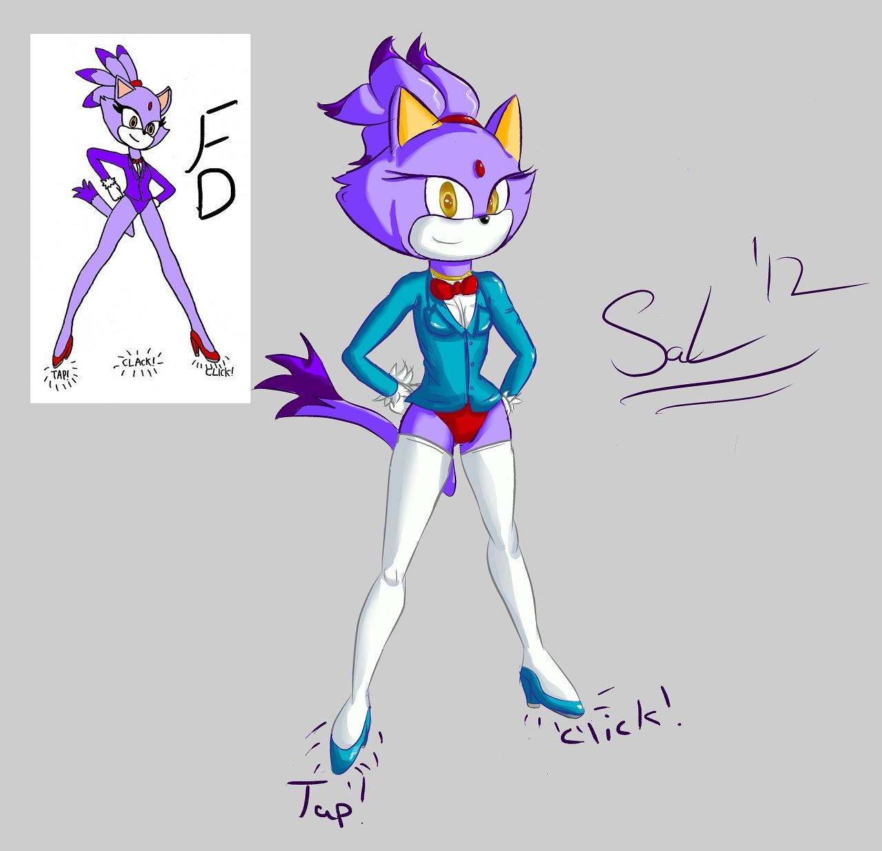
I finished it! This is my first time coloring my OWN work, Sallyhot didn't do it for me or walk me through it. XD All me. :) Woo! I'll get better at coloring for sure! Anyway, this is the final version, it looks loads better than the flats version. Hope you like!

Keywords
female 1,006,029, cat 199,624, sonic the hedgehog 56,997, blaze the cat 7,055, sal 227, tap dancing 38
Details
Type: Picture/Pinup
Published: 11 years, 5 months ago
Rating: General

MD5 Hash for Page 1... Show Find Identical Posts [?]
Stats
560 views
28 favorites
10 comments

BBCode Tags Show [?]
 
Norithics
11 years, 5 months ago
Nice! A little shading always adds a lot of depth! It definitely makes the image more appreciable. =)

Do you take critique? I'm very nice about it, and I have some helpful suggestions!
Blazeymix
11 years, 5 months ago
Of course! I'm always up for some helpful tips, this was my first attempt at coloring afterall.
Norithics
11 years, 5 months ago
Great! First, I want to say that I'm really impressed upon looking further in, how many difficult concepts you happily took on despite the fact that they can flummox even a seasoned artist. I'm very interested to see more art from you!

https://dl.dropbox.com/u/71379168/BlazeTapEdit.jpg

1. A really important thing that even really good, professional artists forget to do sometimes is to keep your angles consistent. If the character is standing straight up, the eyes should line up with the ears, the shoulders, the breasts; every part of the character that you could draw a line from the left to the right of them should all line up. This is very hard to make sure of, but it adds so much consistency to your drawings that you'll be amazed how much easier it makes the whole process! Also, I noticed you decided to go with heeled shoes, which was a very bold move because they're extremely difficult! But using this same 'line up' technique can help you make them look right; just line up the bottom of the heel with the flat of the front sole, and the rest of it becomes a lot easier.

2.  Arm length is something that can be a total pain in any artist's neck, and to this day I find myself having to make lots of revisions with certain poses. A really nice and easy way to remember how long an arm should be is that the upper arm should be long enough that the elbow reaches to the bottom of the ribcage (which I put a little skewed circle in) and their wrist should reach to about a quarter of the way down the thigh (again, with another little red mark for reference).

3. When you have a long-sleeved suit of any kind, it's important to make sure that those sleeves remain more or less uniform. Being that the elbow becomes a very sharp point, you want to make sure to reflect that in even the starchiest of outfits. But in return, you can make it look natural and less like a cloth pipe by adding folds at the inner elbow, giving the fabric a sense of rumpling and moving with the arm. Also, if you're a fan of big ol' butts like I am, I marked a line down below where you could have drawn in a bit more thickness for Blaze's Broadway-bound backside. =)

4. You really did a fantastic job shading this- the highlights are minimalist and tastefully placed, the color selection was almost uniformly great, and you even used it to differentiate her head from her cheek tufts! That's some great usage of 'Psychic Line,' and you deserve a lot of credit for it! And while you are very good at picking shades for bold colors, I would like to suggest something that may give your colors a little more pop in the future: Coordinate cool and warm tones. What I mean by this is, for your purples, blues and such, blue is a great choice of color- and I would recommend it for white fur as well, as it adds an organic feel to it! While the reds, oranges and beige colors in this picture could do with some bright orange and red shading at maybe half to 1/3rd opacity on a multiply layer. Play around with this and find the tones you like!

I really love your work thus far, you're so creative! I'm super looking forward to what you come up with next. =D
Blazeymix
11 years, 5 months ago
xP Wow thanks. This'll be very helpful. I'm decent at drawing, but like I tell everybody I've a long ways to go. As far as coloring, I just did what I thought looked good. XD I know nothing of cold and warm, etc. Mulitply layer? o.o xD See what I mean?

Still, for 1, this might be the most useful thing to know. Lining up, I'll definitely remember that and practice. It's still a little hard for me to get all the angles right, but I still try. You're talking to a girl who taught herself everything about drawing up to this point. :P So all that technical stuff and techniques like lining up, it's all very new to me.

For 2, I usually don't have too much trouble with the arms. But other times, like this, I can't seem to get em right. xP I'll keep at it!

For 3, I didn't like too much how the sleeves looked either, not enough rolls and such. But every time I tried to put one in there, it just didn't look right. I didn't even think about the elbow though, so that should be helpful next time I try. Also, I don't mind big bums, xD But I thought I did that part okay. I didn't want to over exaggerate the sexiness and all.

For 4, I'm glad you liked my shading. xD I did tons of shading with pencil before converting to digital, so I have a little experience with it. As far as coordinating cool and warm colors, well... I don't know about multiply layer and all that. xD Blue as a shade for purple? o.o Seems.. Idk. This whole thing you exlained in 4 is confusing for me, if I tried coloring again it would probably have the same problems you saw with the coloring cause I just don't get it exactly. Somewhat, but not fully enough to have confidence. xD

So thanks, :) I'll work on it.
wetmilkyway
11 years, 5 months ago
This is just pure amazement! >v< The shading is terrific especially that YOU colored it! :D I love how you shaded her jacket. It looks realistic! C: Fantastic job coloring this SaL! <3
Blazeymix
11 years, 5 months ago
Aww thank so much, Lola! X) Funny, I thought I messed up her jacket. xD <3
wetmilkyway
11 years, 5 months ago
No problem SaL. <3 And no way! It looks realistic and terrific! >u<
Wakka
11 years, 5 months ago
Now that's the kind of skill i need for my own art. my coloring is -----ok but i think looking at a stick would be more interesting color wise then my own. :D

Awesome pic SaL i can defiantly see the difference from the flats version and yours.  excellent work SaL keep it up. ^^_
Blazeymix
11 years, 5 months ago
Maybe I can teach you sometime, Wakka. :) By the way, you interested in joining Team Acorn? :o
Wakka
11 years, 5 months ago
That's not choice i can easily make. it would give me motivation and pride. im a slow learner but a good moral booster like being part of Team Acorn goes a long way. *Takes A Swig Of Tea* i happily accept to be part of the team SaL. my art skills may lack refinement but ill make up for what i lack in due time and support Team Acorn as best i can.  ^^_
New Comment:
Move reply box to top
Log in or create an account to comment.