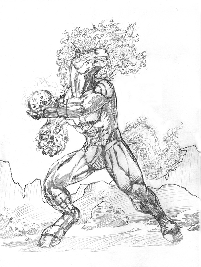
There was a lot of white space in the lower left corner, the perspective felt off and overall, he felt too obscured by his throwing arm. It was a great concept, but didn't really feel right.
This one feels much better on all those counts, though I will admit to feeling like it's lost some of the dynamics of the previous piece. But, I'll take a slightly less dynamic camera angle if it means having a strong, balanced and imposing figure instead. :)


")